
Your outdoor space becomes a living canvas when thoughtful color combinations take center stage. Unlike walls or furniture, plants offer ever-changing hues that shift with seasons and light conditions. This dynamic quality makes strategic color planning essential for crafting visually harmonious environments.
Seasoned designers recognize that successful landscapes balance multiple elements. Structure provides bones, texture adds depth, and movement creates energy. Yet for most enthusiasts, it’s the emotional power of color that sparks initial inspiration. Legendary experts like Penelope Hobhouse and Christopher Lloyd revolutionized approaches through their explorations of seasonal palettes and plant partnerships.
Mastering chromatic harmony requires more than personal preference. It demands understanding color theory through nature’s lens – how lavender plays with goldenrod, or crimson foliage pops against evergreen backdrops. This guide shares practical methods developed through decades of horticultural practice, helping you avoid common pitfalls while maximizing visual impact.
Key Takeaways
- Color serves as the most immediate tool for personalizing outdoor areas
- Successful designs balance chromatic elements with structural and textural components
- Modern approaches build on foundational work by leading garden authors
- Plant-based color schemes require different strategies than static design mediums
- Effective plans consider both aesthetic appeal and plant growth requirements
- Visual impact can be achieved in spaces of any size through smart color placement
Understanding the Role of Color in Garden Design
Your garden’s palette acts like a visual signature, revealing tastes and energizing spaces through strategic combinations. Unlike fixed decor, plants let you paint with living hues that evolve daily, creating dynamic scenes that mirror your character.
Painting Personalities With Petals
Bold reds and oranges shout confidence, while soft blues whisper calm. These choices shape how visitors feel in your space. Warm tones spark lively gatherings near patios, whereas cool shades create meditation nooks under trees.
| Color Type | Mood Effect | Plant Examples |
|---|---|---|
| Warm | Energizing | Marigolds, Red Hot Pokers |
| Cool | Relaxing | Hydrangeas, Lavender |
| Neutral | Balancing | Silver Dust, Lamb’s Ear |
Roots of Modern Color Theory
Rosemary Verey’s structured designs showed how repetition creates rhythm. Christopher Lloyd’s wildflower mixes proved controlled chaos could dazzle. These pioneers taught us to work with nature’s changes rather than against them.
Gardens demand flexibility – a crimson maple in fall becomes bare branches by winter. This living canvas requires planning for seasonal acts, not just opening-day snapshots. Your choices today shape tomorrow’s ever-changing masterpiece.
Fundamental Principles of Color Theory for Gardens
Gardens transform into vibrant masterpieces when color relationships are understood. Just like mixing paints, plant combinations follow universal rules that guide visual harmony. Let’s explore nature’s chromatic building blocks.
Primary, Secondary, Tertiary, and Neutral Colors
The chromatic journey starts with three primary colors: fiery red, sunny yellow, and sky blue. Combine these to create secondary hues – orange’s warmth, green’s freshness, and purple’s richness. Tertiary shades like blue-green emerge when primary and secondary tones blend.
Neutrals act as the garden’s peacemakers. Crisp white flowers calm a riot of reds, while chocolate-hued hardscaping grounds electric yellows. These quiet tones let vibrant neighbors shine without competition.
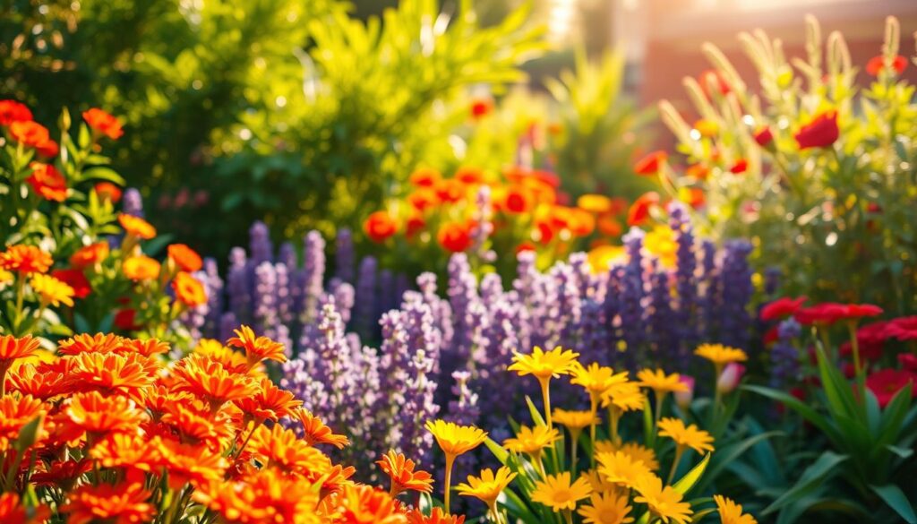
Warm vs. Cool Colors in Garden Settings
Sun-drenched areas become stages for warm tones. Marigolds and daylilies glow brighter under direct light, their orange and yellow petals radiating energy. Place these near seating areas to stimulate conversation.
Cool colors thrive in dappled shade where their subtlety shines. Hydrangea blues deepen under tree canopies, while lavender’s purple spikes gain definition. Pastel phlox and forget-me-nots maintain their delicate hues in morning light but fade in afternoon glare.
Remember: warm tones advance, cool tones retreat. Use crimson roses to shorten long pathways, or blue salvias to make small spaces feel deeper. This temperature play becomes your secret design tool.
Planning Your Garden's Color Palette
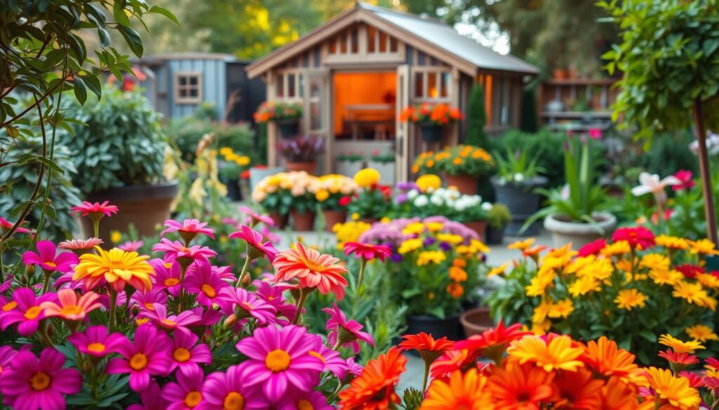
Crafting a cohesive color garden design begins with intentional selection long before plants enter the ground. Savvy designers treat nurseries as interactive showrooms – hold potential purchases side-by-side to preview combinations. Lay potted specimens on grass to simulate spacing and contrast effects.
Hardware stores offer unexpected tools for color palette development. Paint swatches become portable mood boards – cluster complementary shades on your kitchen table to test schemes. This method prevents costly mismatches and reveals surprising harmonies between coral zinnias and terracotta planters.
Selecting a Consistent Color Scheme
Timing proves crucial when building seasonal interest. Chart bloom periods using a calendar to ensure peonies don’t overshadow later-blooming asters. Group plants with overlapping flowering time frames to maintain balanced displays from spring through frost.
Architectural elements demand consideration too. A cobalt-blue front door calls for repeating that hue in delphiniums or agapanthus clusters. Neutral house exteriors become blank canvases for experimenting with bold color rotations year after year.
Successful schemes embrace change – early tulip fireworks give way to summer rose symphonies. Document your evolving color palette with seasonal photos, noting which pairings delight and which clash. This living record becomes your roadmap for future plant investments.
Integrating Light, Sun Exposure, and Seasonal Elements
Light transforms outdoor spaces like a master painter’s brush, altering hues from dawn to dusk. Strategic placement of blooms based on sun exposure ensures colors maintain their vibrancy throughout daily cycles. This dance between illumination and pigment turns ordinary beds into dynamic displays.
Adapting Colors for Different Times of Day
Morning’s soft glow enhances pastel shades. Pale pink peonies and white nicotiana shimmer in early light, perfect for east-facing borders. As full sun intensifies at midday, fiery marigolds and orange poppies take center stage, their warm tones radiating energy.
Evening’s golden hour deepens cool hues. Purple salvias and blue lobelia gain richness as shadows lengthen. Position these near seating areas where twilight gatherings occur. Pale yellows like evening primrose act as natural lanterns, reflecting residual sunlight after dusk.
| Color Type | Best Location | Plant Examples |
|---|---|---|
| Warm | Full sun zones | Daylilies, Coreopsis |
| Cool | Partial shade | Hydrangeas, Columbine |
| Pale | Low-light areas | Snowdrops, Foxgloves |
Seasonal shifts demand flexibility. Autumn’s angled light intensifies red maples but washes out summer pastels. In cloudy regions, saturated colors like crimson roses compensate for frequent overcast skies. Sunny climates benefit from silver foliage that deflects harsh rays while maintaining visual interest.
Transition smoothly between light conditions by planting golden hakone grass where sun meets shade. Its chartreuse blades bridge warm and cool palettes, creating cohesion in mixed-exposure gardens.
How to Use Color Effectively In The Garden
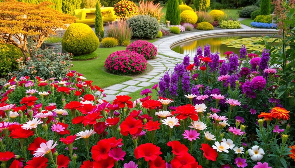
Chromatic harmonies in outdoor spaces function like a well-composed symphony, where repetition and contrast create rhythm. Repeating specific hues across beds establishes continuity, while strategic contrasts add dramatic punctuation. This approach transforms disjointed plantings into unified displays that delight the eye.
Strategies for Repeating Colors for Cohesion
Establish visual flow by echoing key shades throughout your landscape. Purple salvias near the patio might reappear as lavender spikes along walkways, creating invisible threads that connect spaces. This technique works particularly well in long, narrow gardens where repetition prevents a scattered look.
| Repeated Color | Plant Partners | Visual Effect |
|---|---|---|
| Silver | Artemisia + Dusty Miller | Unifies sunny & shady zones |
| Yellow | Black-Eyed Susan + Goldenrod | Guides eye through space |
| Burgundy | Heuchera + Japanese Maple | Adds depth to borders |
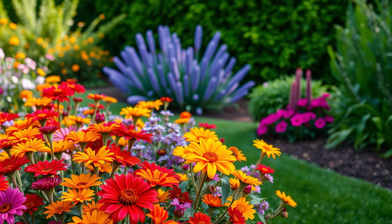
Balancing Bold and Subtle Tones
Dark tones command attention when used sparingly. Three crimson roses against white phlox create focal points without overwhelming. For evening drama, pair pale moonflowers with deep purple clematis – the contrast intensifies as daylight fades.
Consider these contrast guidelines:
| Background | Accent Color | Effect |
|---|---|---|
| Light foliage | Deep purple | Dramatic focal points |
| Dark hedges | Soft pink | Romantic highlights |
| Neutral stone | Orange blooms | Modern pop effect |
Test combinations using potted plants before committing. Move containers around during different daylight hours to see how relationships shift. This living laboratory approach helps refine your composition while considering seasonal changes.
Exploring Diverse Color Schemes for Optimal Impact
Nature’s rainbow offers endless possibilities when you understand color relationships. The color wheel becomes your map for creating combinations that sing in harmony or spark exciting tension. Let’s decode four professional approaches to chromatic arrangements.
Complementary and Counterpoint Schemes
Opposites attract in complementary pairings. Imagine purple salvias blazing against golden marigolds – this high-contrast combo stops viewers in their tracks. For softer drama, try counterpoint schemes. Pair peach roses with blue-green hostas instead of pure orange-blue contrasts.
Split-Complementary and Diadic Approaches
Split schemes add nuance using three hues. Start with coral begonias, then flank them with blue-violet ageratum and yellow coreopsis. This triad maintains energy without overwhelming. Diadic schemes like lavender and sage green offer gentle contrast, perfect for cottage gardens needing subtle structure.
| Scheme Type | Colors Used | Garden Effect |
|---|---|---|
| Complementary | Red + Green | Bold focal points |
| Counterpoint | Yellow + Blue-Violet | Dynamic tension |
| Split-Complementary | Orange + Blue + Purple | Balanced energy |
| Diadic | Pink + Yellow-Orange | Subtle movement |
Real-world tip: Check bloom times! Red tulips and blue forget-me-nots make perfect spring complements, but stagger plantings so one doesn’t fade before the other. For low-maintenance combos, try foliage-based schemes – burgundy heuchera and silver artemisia work year-round.
Transition between schemes by repeating one anchor color. Use white Shasta daisies to bridge fiery summer combos and mellow autumn golds. This creates visual flow while letting seasonal stars shine.
Embracing Botanical Elements: Flowers and Foliage
Leaves hold secrets to visual drama often overlooked in garden design. While blooms grab attention, foliage provides the steady rhythm that makes compositions sing. Those silvery sage stems and burgundy maple leaves? They’re not just supporting actors – they’re essential players in your outdoor theater.
Utilizing Green Foliage for Contrast
Green foliage comes in more variations than a paint store sample wall. Chartreuse hostas brighten shady corners, while blue-toned junipers cool sunbaked slopes. Pair feathery ferns with rubbery bergenia leaves to create textural interest that lasts beyond flowering seasons.
Dark-leaved plants like heuchera act as natural shadows, making neighboring yellows pop. Silver artemisia reflects sunlight, giving beds a luminous quality. These variations turn what seems monotonous into a dynamic foundation for brighter accents.
Highlighting Unique Blooms
Flowers become superstars when framed properly. A single red tulip shines against black mondo grass. Pale pink peonies gain elegance when surrounded by blue-green hosta leaves. This interplay lets you control where eyes linger.
Remember: foliage sets the stage, but plants with colorful leaves like coral bells can share the spotlight. Variegated ivy or striped caladiums offer dual-purpose beauty, working as both supporting and lead actors in your living composition.
FAQ
Q: How does color reflect personality in garden design?
A: Color choices often mirror personal preferences and emotions. Bold reds or yellows create vibrant energy, while soft blues or pastels evoke calmness. Your palette becomes a visual extension of your style.
Q: What’s the difference between warm and cool colors in gardens?
A: Warm tones like reds, oranges, and yellows energize spaces and appear closer. Cool hues like blues, purples, and greens add calmness and recede visually, enhancing depth in smaller areas.
Q: How do I choose a cohesive color scheme for my garden?
A: Start with a base of neutrals like white or gray. Pick 2–3 dominant colors and repeat them through flowers, foliage, or decor. Use a color wheel to identify harmonious combos like analogous or monochromatic.
Q: Can sunlight affect how garden colors look?
A: Absolutely! Full sun intensifies bright tones, while shade softens them. Test samples at different times of day. Silver foliage glows at dusk, and white blooms shine in moonlight.
Q: How do I balance bold and subtle colors without overwhelming the space?
A: Use bold hues as focal points, like red poppies in a border. Soften with neutral greens or muted lavenders. Limit intense shades to 20% of the design for balance.
Q: What’s a split-complementary color scheme?
A: It uses one base color plus two adjacent to its complement. For example, pair violet with yellow-green and yellow-orange. This creates vibrant contrast without harsh clashes.
Q: Why is green foliage important in color design?
A: Greens act as natural neutrals, offering rest between bright blooms. Variegated leaves add texture, while deep greens make pastels pop. They’re essential for year-round structure.
Q: How can I keep my garden colorful across seasons?
A: Mix plants with staggered bloom times. Spring bulbs, summer perennials, and fall foliage extend interest. Evergreens and berries maintain winter appeal.